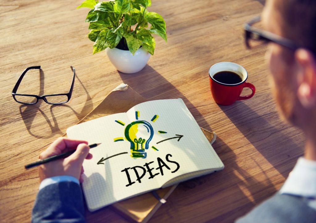
20 Entrepreneurs Explain How They Selected a Logo for Their Business
CB
Selecting a logo is a big decision because it establishes the brand of your company. For entrepreneurs and business owners it is sometimes not an easy and simple process. We decided to ask some entrepreneurs and business owners how they decided a logo for their business and any tips they had for other business owners.
# 1 – Balancing the Elements of the Brand
Coming up with a business logo was a very iterative process for us. Oliver Cabell is a new fashion brand that is disrupting the traditional market while still holding true to its industry, fashion, so we needed to create a logo that balanced these elements. Our brand is also a bit playful, which brought on an additional challenge. We spent months analyzing competitors logos and brands that we inspire, and tried to determine what make us feel a certain way. By bringing in elements such as round corners and a traditional type face, we were able to come up with something that was unique to our brand.
Before we began the logo we knew the choice of name was super important for us, when we first set up we struggled for names and I randomly started going through Wikipedia and came across fighter jets. Our name is Strafe Creative and to “strafe” is when a fighter jet quickly changes direction. We liked the idea that after people worked with us we could change the direction of their business for the good. Strafe is also a German word for power (Strafen) and we like the idea of efficiency that Germany in known for. With “Strafe” settled on we wanted to keep the logo fun as we’re both young, so we decided to use a more playful option and chose a paper plane. We use our logo across lots of different media so we chose to use a circle as this could then be used on its own as a sub logo as well as with the text. We rounded the edges of the plane to ensure it still looked playful and not too sharp and also when the logo is scaled down it still prints cleanly, which can be lost with sharp edges. As a designer agency we spent along time creating this logo and we still love it.
As a solo entrepreneur my budget was very small when I started Mind over Clutter. I went to a friend that was an artist and we brainstormed some ideas for my logo. She started to sketch ideas and eventually and she came up with the design. It only took about an hour. My next step was to give the sketch to my web designer, Janet Barclay Organized Assistant, because part of my web package included a graphic designer creating the logo. The graphic designer gave me 4 versiMind Over Clutterons of my logo and then I asked friends, exercise participants, networking group members which one they liked best. From that unofficial poll I made my choice and I have not changed it. One piece of advice I would like to include is when you are working with a graphic designer get your logo in every possible format you can think of, jpeg, gif, ai, DST, ESP etc and in colour and in black and white. If you have your logo in many formats than when an advertiser, sign maker, clothing designer, needs your logo you will be able to avoid additional graphic designer charges in the future.
#4 -Map a Logo that Expresses Internal Brand Values
Creating the Pixel8 logo has been an enjoyable process, partly influenced by the earlyAtari video games and the ZX Spectrum console graphics in the 1980's. The Pixel8 logo is more than just a random icon that sit on our company letterhead and home page, it's our badge that we wear with pride, it represents who we are and expresses our values. The importance and psychology behind the orange colour, the font choice and the simplicity of the pixel square shape are all decisions that have been carefully mapped to deliver an logo that radiates warmth and energy, delivers an optimistic and uplifting feel and expresses our internal brand values.
Having started a luxury real estate brand meant that a strong and recognizable logo had to be crafted. Making something that was representative of the name but also clean and modern was a bit of a challenge. I went through the phases of using cursive lettering and fonts that were classically associated with luxury. However, suddenly I realized that the business I had formed focused on implementing technology into the luxury real estate domain. Therefore the logo had to utilize simplicity, clean lines and a contemporary aura. Using a simple font and eliminating the cross line in the A formed a perfect composition of straight angled lines that both look striking and maintain a classy and luxurious feel. This summarized the name of the business and goal within a single image logo.
Our company sells series of adventure books introducing world cultures to kids that arrive in very cool packages from abroad. Our logo needed to communicate a lot, so it took a lot of fine tuning to get it right. Being that my company is called The Adventurous Mailbox, I knew I wanted to have a mailbox front and center. I also wanted to include a bit of adventure in the logo, so knew it needed to take flight or have some sort of adventurous element. Also, though our products for kids have a strong digital and online component, we wanted to impart of bit of nostalgia for the joy kids feel when getting a special package in the mail, which is how our core products are delivered. After versions with mailboxes having elements like an eagle’s wings or a tiger’s tail, I settled on a mailbox with old fashioned airplane wings, tilting up as if taking flight. This gave it the perfect retro feel, and the angle it is positioned in gives a strong sense of action. The finishing touch was the circle around it, which gives the feeling of a postmark or passport stamp.The Adventurous Mailbox The end result was a beautiful, non-cutesy logo that delivers our image as well as our concept. I love it so much I am thinking of getting it tattooed!
Our brand is about promoting and nurturing growth for our clients – from an idea, a concept, a “seed,” all the way though to the final product, the visual media manifestation of that idea. As a company and creative team, we create our own opportunities and encourage others, our clients, our employees, and our audience, to do the same. Lastly, we offer fresh and innovative solutions to our clients, and unique deliverables within our digital media scope – for example, once we finish a video production, we offer consulting services to our clients, to help them best incorporate that video into their overall marketing strategy, as well as the tools (ie. a brand new website or updated marketing collateral) to make it happen. The imagery we chose for our logo had to combine those aspects of our company and services: a tree that “reaches” to the future (up and to the right of the logo) with a doorway for current prospects; our company name, Waverley Knobs Entertainment, make up the roots of the logo, as we are the foundation upon which the “seeds” sprout and grow to the sky!
When I was starting my business, Simon Says Social Media, I wanted to support dog rescue as part of the mission. This is important to me personally because my dog Eli is a rescue. So I made Eli the company mascot and decided he should be part of the logo, but I also wanted it to represent what we do as a company – social media marketing, and our company voice – modern and fun. So with the help of a graphic artist, I combined a stylized version of Eli with a speech bubble and fun modern text. I loved it as soon as I saw the first version and didn't make any changes. I consistently get compliments and great feedback on it.
It’s funny because most people consider logo creation to be a strictly creative process. For us, it was incredibly academic. One of the members of our board is a college professor, and as we began to consider a new logo, he launched one of his grad students into a behavior-laddering research project to determine the emotional triggers that different logos evoke in consumers. As an online marketing agency and an alternative to costly and wasteful print advertising, we knew we wanted to trigger feelings of environmental consciousness and the sharing of ideas. We also modeled our design after logos that were viewed as trustworthy, memorable and performance-focused — all key focuses for our organization. Through dozens of iterations and lots and lots of survey results, we finally found a logo that both felt organic and that was reminiscent of the immediately recognizable social share button – and thus the Madrivo logo was born.
Like most entrepreneurs, I knew I had a unique concept, and wanted the logo to be bold and strong, and representative of what we do here at Fashion Camp. I started sketching out ideas, and liked the idea of a mascot (now affectionally called “the girl”), and I loved fonts reminiscent of fashion magazines, which were my first connections to the fashion industry. Thankfully, I hooked up with a fantastic graphic artist, and without flinching, nailed it on the first go. He drew up this figure, and it was his idea to play on the word “Camp”, giving our girl her military look, and the salute, and placing in her hands a pair of shears, complete with a measuring tape around her neck. We used Edition font, which even in its name, suggestions magazines, just as I had envisioned. Its been fun watching the evolution of our brand through this logo, using “the girl” as a stamp of our brand on just about everything!
Our logo, a copy of which is attached as well as in my signature block, was pretty easy to choose when our graphics person showed it to us. It has the A, which is the first letter in our company name. The globe represents our finding people all over the world so we can unite them with the money they never knew about. The swoosh, which completes the A, subtly reinforces our global reach.
I actually designed my own. Luckily I had a little bit of training in graphic design and a lot of thinking time. I wanted something simple and recognizable, and most importantly something cute to reflect the dynamic of most of my couples. It was easy to combine my name and my profession (photographer) by adding a lemon to a camera. I came to the conclusion early on in the process that a lemon looks an awful lot like a camera's aperture, but it took some time to perfect the look and get something that said ‘adorable' rather than ‘modern'. But I did it! It's both obvious and subtle and always gets comments from leads and clients. I love how it differentiates my brand from my competition with its unique and strong visuals.
Vamos' logo is inspired by the style of a hand chop stamp because our concept is based on authenticity and being immersed in the culture and language you are studying. Most importantly, all of our clients are travelers. When you travel, you of course get stamps on your passport and a lot of travelers see them as representative of their achievements. They're almost like trophies, a “collection” of world-trotting experiences. We'd like to leave a similar, memorable mark on their travels and learning adventures.
We created our business logo with the idea of both branding the company at the same time as providing a message to our customers that we are a full service helping hand to guide people through any home disaster restoration that they need. The logo represents our ability to provide people with a fresh start by giving them the assistance, expertise, and support needed to make their property better than ever!
Since we operate an e-commerce store, we wanted our logo to be simple, to exemplify the simple ordering process of custom t-shirts and apparel on our website. We also wanted our typeface to exemplify sports and school, since this is our core business model. There is nothing fancy about our logo but it is clean and fits with our site design. We knew the yellow font in the logo would be great for advertising and marketing material when we placed our logo on a black background. It really pops!
Our logo is our brand. Our brand is our business. It lets people know who we are at a glance, reinforces our mission and vision, and it’s all done in the blink of an eye. So your logo should be the most essential element of your marketing strategy.
#17 – Holistic and Fluid My company name is LIDA360. The circular element of the logo represents the 360 part of my name. It shows the holistic and fluid nature of brands. When done correctly, corporate and personal brands continue to grow and mature, but they have anchors.
#18 – Modern, Welcoming, Understated and Whimsical
When I started my software development company, 5 Nerds Software, one of the first areas I focused on was our logo. In this industry, there's an expectation that we're on the cutting edge of development & design trends so having a logo that sent the right message was extremely important. First, I had to consider what that message was. I wanted to make sure it was modern, welcoming, somewhat understated, and a little whimsical if possible. Those qualities embodied my company. Should it be symmetrical? Should there be an element or just the company name? Vertical or horizontal design? We had a lot of decisions to make. We ultimately decided to hide a pair of glasses in the logo to reinforce the nerd in 5 Nerds. We played with a few different ways to get them in there until we struck gold with the e and the d serving as the lenses of the glasses. A little smirk underneath completed the effect. We then considered the uses of our logo website of course, print media, and social media. The latter played a huge role in our decision. We knew we needed a logo that could stand out as a profile picture and be immediately recognizable. And at the small size of most profile pictures, too many colors would just make it blurry. So we decided on a single color logo using negative space to actually convey the image of the logo. We added a black background circle which can change color as needed to suit different situations. And we had our logo! Logos today need to consider the social media aspect consider that many people will see your logo in small profile pictures, on small mobile screens. If branding and recognition is important (which it should be) you want to test your logo in these situations to make sure it fits well and is recognizable at those sizes. We are a full design & development firm so we of course designed our own logo (as well as many others) but the process we went through is identical to the process any company would go through in creating their all important logo.
I designed our logo along with our tagline “play. smarter.” As a sports marketing agency, we feel like we’re not working, but playing. And since everyone works hard, it’s about being smarter, so we play smarter than our competitors. The sideways triangle is universally known as the play button so it was a natural fit for our logo.
JotForm, specializes in online forms, spent close to six months redesigning our logo so we can create brand loyalty. Logos have a way of evoking emotions. Those emotions can go either way. A consumer can either build a strong connection or can cause distaste towards the brand. Choosing the right color for the company, I was thinking of what color represented the brand's personality. Having a logo that stood out would help our business stand out. JotForm eventually created the logo. Our employees are located worldwide, so we had three JotForm logos tested in focus groups. We received the feedback, made more changes to the logo, and finally launched our logo.