Deciding on a logo is a big decision because it establishes the brand of your company. For entrepreneurs and business owners it is sometimes not an easy and simple process. We decided to ask some entrepreneurs and business owners how they came up with a logo for their business and any tips they had for other business owners.
#1- Communicate Quality and Services
 When we created our logo, we knew we wanted it to be strong and impactful. Our value proposition is unmatched quality and strength, and we needed our logo to communicate that. We found a bold, strong font and made that the focal point. Then, we used bold structural elements in the background to evoke the same quality as the products we offer.
Thanks to Jack Shinder, AMBICO
[divider]
#2- Complement the brand and stand out
 Extranet User Manager is a complimentary brand under our main organization. We needed to find a way to make this logo complement the look and feel of our initial brand, while still standing on its own. We settled on a simple design with a noteworthy feature that would make it stand out from the pack.
Thanks to Peter Carson, Envision IT
[divider]
#3- Match with humor presentations
 I was sitting in a restaurant one day with my daughter. She was drawing on a napkin. When I looked over it was a cartoon drawing of me. Since I do keynote humor presentations, and give out clown nose to everyone in the audience, it was perfect. I had a graphic artist clean it up and have used it for my logo ever since.
Thanks to Allen Klein
[divider]
#4- Stand for my name and the firm's value
 Designed by an intern in the spring of 2017,the logo of Malik Law Firm has two meanings. The obvious one is the M inside the circle, which represents my name, Merium Malik. It is shaped like an electrocardiogram, indicating the firm's culture of establishing real, sincere connection with clients. In addition, the logo is in blue, which stands for the firm's professionalism and efficiency.
Thanks to Merium Malik,Malik Law Firm, P.C.
[divider]
#5- Refined our design ideas
 Our company is JQBX. We are an online music platform that lets you play tracks any Spotify track in sync with other users around the world. Our logo started with a sketch, some business parameters, and some competitor research. Refining your design decisions up front is immensely helpful since you can cut out a lot of ideas really quickly. In our case we knew upfront that we wanted our logo to be a circle since we had a desktop application and circles tend to look professional in the dock. We also knew that we wanted our brand name front and center within the logo so that people would remember the URL. I personally ended up designing it because it kept our costs low. The main thing to remember when doing something creative is that you can build up layers and details over time. I started with a sketch of something simple and slowly added details and gradients as time went on to build the logo as it exists now
Thanks to Jason Zigelbaum, JQBX FM
[divider]
#6- To define our values
 The logo of my firm is that of a raw cut aqua marine crystal and it represents transparency, innovation and positive outcome. A crystal is like a memory chip which has been recording the frequencies of our planet's growth for centuries together. The discovery of this innovation precisely outlines the base of intellectual property rights which my law firm specializes in. The word INTELLEXSYS is developed by conjoining the words intel from intellectual, lex, i.e. legal in latin and sys short for system to mean intellectual legal systematic solutions. In short, the word ‘Intellexsys' and the logo define our firm values.
Thanks to Adv. Roshni Lachhwani, Intellexsys Legal Solutions
[divider]
#7- Analysed what I do
 My logo for my brand, The Terrorist Therapist, is a combination of a psychoanalyst’s couch, the word TERRORISM under a microscope, and my photo. It also has my title, The Terrorist Therapist, and and my tag line “Helping families keep calm and carry on! In a nutshell, it explains that I analyze terrorism in order to help families cope with the psychological fallout of living in today’s times.
Thanks to Carole Lieberman M.D.
[divider]
#8- To create impact to the brand
 Two years ago, our company created a new logo for a rebranding. The idea was not only to opt for something more trendy, innovative and technological, but also to adopt more avant garde and minimalist forms and lettering. This was a successful bet, since the new logo provided a great impact to the brand and its materials in both online and offline marketing endeavors.
Thanks to Antonie Moreau, Mobidea
[divider]
#9- Validated my idea through a competition
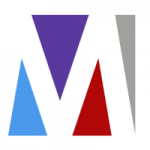 I launched a competition to have my logo designed. I had a few colors in mind and had the idea of somehow incorporating four shapes to represent the four pillars (marketing, business development, communications and human capital) of my marketing agency. In developing my design brief I took care to describe my business and its target market, along with my style preferences and the attributes I sought to inject into my logo. For example, did I want it to be classic or modern? Mature or youthful? Economical or complex? Playful or sophisticated. I wanted the choice of with or without a tagline. And I was adamant that the logo should include an icon or marque so that in time it could become a stand-alone element in much the same way as the ‘swoosh' has come to represent Nike. Over the course of about two weeks I received 148 entries from designers from seven countries. Many of the entries I disqualified immediately – they weren't to my taste or didn't fit the brief. Some had potential but required tweaking. A few I shortlisted right away. The logo I ultimately chose was the work of a designer in Indonesia. What I liked most about it was the marque's negative space and how it gave the appearance of forming a letter ‘M'. That white space has become an important element of the visual identity.
Thanks to Jacqueline Burns, Market Expertise
#10- To represent the sectors we work in
 Our logo needed to represent the sectors we work in, which was a tall ask as we are a specialist agency focusing on quite a few areas: the countryside, equestrian, pet and luxury sector. Previously our logo incorporated a symbol of a horse, as we started life as an equestrian agency but have over time merged naturally into other areas so it needed a change. We worked UK creative agency Pretty Amazing Creative on the brief that we needed to show at a glance what we did but would translate well across all platforms and needs. The final logo features symbols which explain our sectors sitting within a shield to give a coat of arms feel complete with stag horns. This combined with the contemporary and classic colors fits perfectly with what we do and the areas we work in. We'd suggest: Do your research and go for someone who doesn't have experience in logo design in your industry. They'll have a fresh perspective on your business and sector and won't be influenced by other companies in your industry.
Thanks to Ashley Rossiter, MirrorMePR
[divider]
#11- Create a strong visual impression
 As a designer, if you work with a small brand, you can spend a long time working on a logo, getting the right colour look and feel, and then it's never used. A lot of your work can become white noise that's not important. With a big brand, you get to look at all the tiny corners, little nooks and crannies where this brand will be used. Your work will be seen and your logo has to stand up to that publicity. When you're developing a new brand, the first thing you come up with might be a logo, but obviously there's a big difference between a logo and a brand, A logo is often the starting point of the visuals behind a brand as it's the stamp that you include everywhere. Branding as a whole is everything about the look of your visual language. From colors to graphics to letterheads, it should all carry your brand style and not just be stamped with a logo.
Thanks to Neil Robinson, Mason Frank International
[divider]














![Monday Motivation: The Psychopathic Mindset of Michael Jordan [VIDEO]](https://storage.googleapis.com/stateless-ceoblognation-com/sites/2/2017/07/Michael-Jordan-Quote-Desktop-Wallpapers.jpg)



 |
|